ITV News | Podcast Player
Native app podcast player
Company:
ASOS
Duration:
5 months
Platforms:
iOS & Android
Role:
Lead Product Designer • 0-1
TL;DR
I led the end-to-end design of ASOS's new app-only Rewards Hub - a gamified loyalty experience. When a financial review forced a fundamental rethink of the entire product model mid-project, I ran a pivot workshop, redefined the problem, explored six mechanics with my PM, and designed a new solution that turned a business constraint into a more compelling user experience. The project reached validated, stakeholder-approved concepts ready for development.
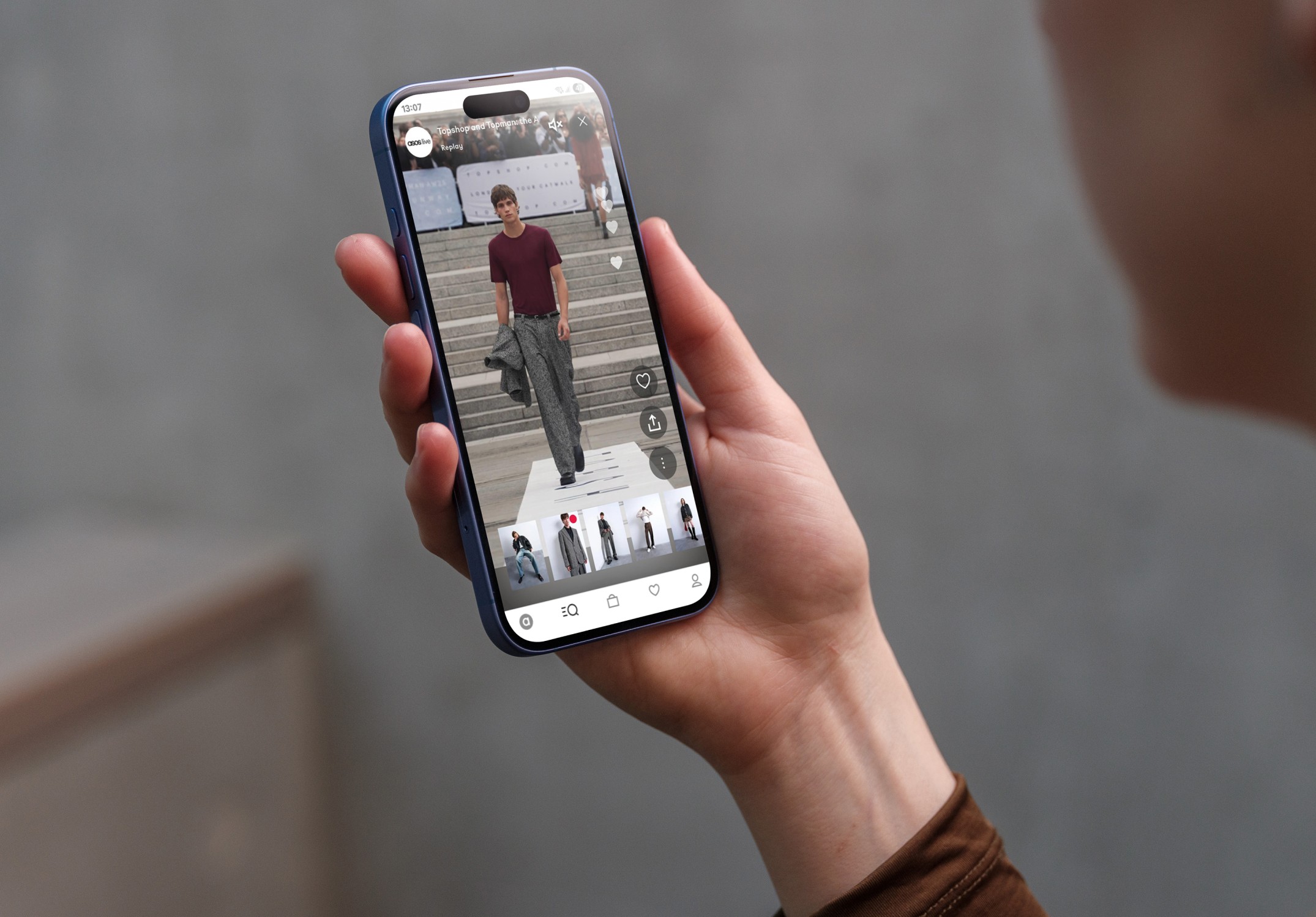
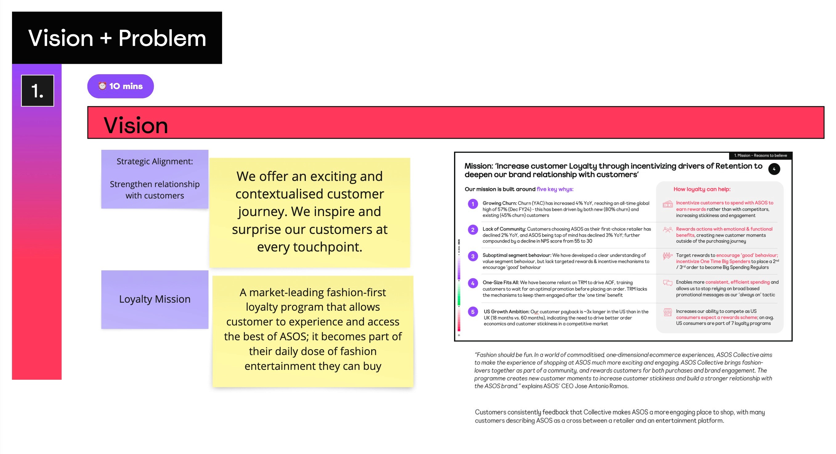
ASOS was launching ASOS.World - a new loyalty programme designed to reward members with exclusive perks including early sale access, members-only offers and real-world event invitations. Phase two introduced points earned through shopping and high-value actions, redeemable for exclusive rewards via a dedicated Rewards Hub.
ASOS was launching ASOS.World - a new loyalty programme designed to reward members with exclusive perks including early sale access, members-only offers and real-world event invitations. Phase two introduced points earned through shopping and high-value actions, redeemable for exclusive rewards via a dedicated Rewards Hub.

End-to-end design ownership from discovery through to validated, stakeholder-approved concepts. I led all research, facilitated workshops, defined the product mechanic alongside my PM, prototyped and tested multiple concepts, and drove the creative direction of the final experience.
ASOS needed a rewards destination that felt distinctly un-transactional - playful, exclusive and worth coming back to. The challenge was designing something that balanced genuine user delight with commercial viability, in a space where loyalty programmes typically feel generic and forgettable.
Create a dynamic destination that drives regular app engagement
Create a dynamic destination that drives regular app engagement
Build an experience that feels exclusive and generous rather than transactional
Build an experience that feels exclusive and generous rather than transactional
Strengthen overall brand perception and reduce churn
Strengthen overall brand perception and reduce churn
Visioning workshop
I kicked off with a visioning workshop to align stakeholders on goals and early principles. One thing was unanimous from the start - this needed to feel exclusive, trend-led and rewarding. Personalisation and a sense of exclusivity were non-negotiable.


User research
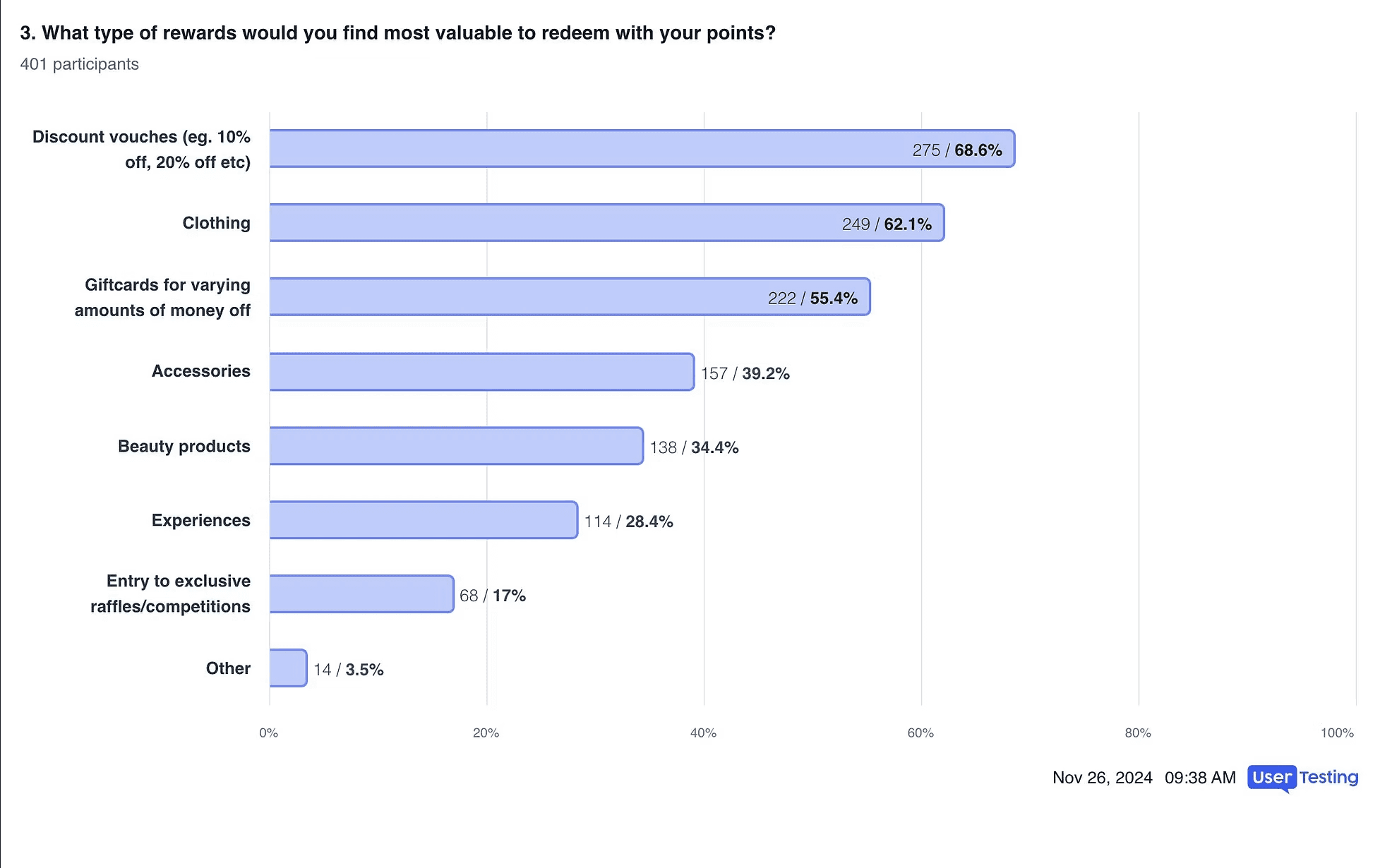
Competitor reviews and user surveys surfaced two clear themes. First, personalisation and variety drive engagement - users responded to experiences that felt tailored and worth returning to. Second, clarity builds confidence - transparent communication around reward access, progress and time limits reduced friction and increased trust.
Visioning workshop
I kicked off with a visioning workshop to align stakeholders on goals and early principles. One thing was unanimous from the start - this needed to feel like a game, not a shop. Gamification, personalisation and a sense of exclusivity were non-negotiable.
Feature definition
Working with my PM and Engineering Lead, I ran a Jobs-to-be-Done feature breakdown workshop to map MVP scope using MoSCoW prioritisation. This gave us a clear, agreed view of what was essential for launch versus what could follow.


Hierarchy and navigation
Getting alignment on the rewards hub structure proved difficult - stakeholder requirements were ambiguous and occasionally conflicting. I ran a card sorting workshop to define the optimal hierarchy and navigation, then wireframed three user flows and tested them with users to determine which structure felt most intuitive.
Feature definition
Working with my PM and Engineering Lead, I ran a Jobs-to-be-Done feature breakdown workshop to map MVP scope using MoSCoW prioritisation. This gave us a clear, agreed view of what was essential for launch versus what could follow.
Midway through the project, a financial review determined that the original points-as-currency model wasn't viable at scale. This meant the entire product vision had to shift — if users couldn't spend points on rewards directly, the fundamental question became: what is the value of points at all, and what does a Rewards Hub even offer?
Rather than letting stakeholders drive to a solution, I organised a Pivot Workshop with all key stakeholders, designers, PMs and engineers connected to the wider loyalty team. We deep-dived the new business constraints, reframed the problem using How Might We questions, and collectively brainstormed solution directions.
Testing revealed that tab navigation combined with My Account access was the strongest option. I refined the user flow based on those insights and got stakeholder sign-off on the direction.
Midway through the project, a financial review determined that the original points-as-currency model wasn't viable. This meant the entire product vision had to shift - if users couldn't spend points on rewards directly, the fundamental question became: what is the value of points at all, and what does a Rewards Hub even offer?
Rather than letting stakeholders drive to a solution, I organised a Pivot Workshop with all key stakeholders, designers, PMs and engineers connected to the wider loyalty team. We deep-dived the new business constraints, reframed the problem using How Might We questions, and collectively brainstormed solution directions.
Exploring the mechanics
My PM and I cleared our calendars and spent several days exploring possible models - balancing business safety with user delight. We narrowed the field to four viable concepts and tested them with users and stakeholders against key criteria including engagement frequency, emotional connection and commercial viability.
Two concepts stood out. One offered clear milestone-based progression that motivated users and gave the business flexibility. The other delivered a highly personalised, gamified experience that users loved but was more resource-intensive to maintain.

The solution
Rather than choosing between them, we combined the strongest elements of both into a hybrid model - milestone progress tracking plus a bingo-card style Vault unlock mechanic.
The core idea: points contribute to a progress tracker. Reaching a milestone unlocks the Vault - a time-limited, interactive experience where users tear open a mystery parcel to reveal a curated set of rewards to choose from. Access expires after seven days, creating urgency and exclusivity. The Vault only reopens at the next milestone.
This approach moved away from the constraints of the original model while creating something far more emotionally engaging - a loyalty experience built around anticipation, play and surprise rather than a standard rewards shop.

The Vault experience was designed as a fully interactive moment, an animation inspired by ASOS's white noise branding dissolves to reveal a mystery parcel, which users tear open to reveal their rewards. The interaction drew inspiration from the Pokémon app, designed to feel playful and memorable.
The reward carousel was intentionally stripped of pricing and points information, reinforcing the shift away from transactional value and keeping the focus on the delight of unlocking something earned.
Navigation had already been validated in earlier testing, so this phase focused entirely on the end-to-end Vault journey: entering the hub, hitting a milestone, unlocking the Vault, interacting with the parcel reveal, and selecting a reward.
The project reached fully validated, stakeholder-approved concepts ready for handoff to development. The pivot - which could have derailed the project - ultimately produced a more distinctive and emotionally resonant product than the original brief. By reframing a business constraint as a design opportunity, we moved from a standard loyalty shop to something genuinely memorable.
Midway through the project, a financial review determined that the original points-as-currency model wasn't viable at scale. This meant the entire product vision had to shift - if users couldn't spend points on rewards directly, the fundamental question became: what is the value of points at all, and what does a Rewards Hub even offer?
Rather than letting stakeholders drive to a solution, I organised a Pivot Workshop with all key stakeholders, designers, PMs and engineers connected to the wider loyalty team. We deep-dived the new business constraints, reframed the problem using How Might We questions, and collectively brainstormed solution directions.
The project reached fully validated, stakeholder-approved concepts ready for handoff to development. The pivot, which could have derailed the project, ultimately produced a more distinctive and emotionally resonant product than the original brief. By reframing a business constraint as a design opportunity, we moved from a standard loyalty shop to something genuinely memorable.
The Vault experience was designed as a fully interactive moment - an animation inspired by ASOS's white noise branding dissolves to reveal a mystery parcel, which users tear open to reveal their rewards. The interaction drew inspiration from the Pokémon app, designed to feel playful and memorable.
The reward carousel was intentionally stripped of pricing and points information - reinforcing the shift away from transactional value and keeping the focus on the delight of unlocking something earned.
Navigation had already been validated in earlier testing, so this phase focused entirely on the end-to-end Vault journey: entering the hub, hitting a milestone, unlocking the Vault, interacting with the parcel reveal, and selecting a reward.
Validate navigation early.
Getting the structural decisions tested and signed off before the pivot meant we could focus the second phase entirely on experience quality rather than relitigating fundamentals.
Constraints can be creative fuel.
The restrictions imposed by the pivot forced us away from a predictable PLP-style loyalty shop and towards something far more brand-right and engaging.
Facilitation is a design skill.
The pivot workshop was as important as any screen I designed. Getting the right people aligned on the right problem was what made the solution possible.
Hierarchy & navigation
Getting alignment on the rewards hub structure proved difficult - stakeholder requirements were ambiguous and occasionally conflicting. I ran a card sorting workshop to define the optimal hierarchy and navigation, then wireframed three user flows and tested them with users to determine which structure felt most intuitive.
Testing revealed that tab navigation combined with My Account access was the strongest option. I refined the user flow based on those insights and got stakeholder sign-off on the direction.
User research
Competitor reviews and user surveys surfaced two clear themes. First, personalisation and variety drive engagement - users responded to experiences that felt tailored and worth returning to. Second, clarity builds confidence - transparent communication around reward access, progress and time limits reduced friction and increased trust.