ASOS Live shopping
Leading design for this 0-1 initiative, launching interactive live shopping on the ASOS app
I led design from discovery to delivery, partnering with product and engineering to define the vision and ship the experience.

Overview/TL;DR
I led the end-to-end design of ASOS Live, a 0 to 1 feature bringing interactive live shopping to the ASOS app. I drove everything from discovery through stakeholder workshops, vendor selection, prototyping, user testing, branding, and iteration.
Results
Uplift in add to bag rate
Increased conversion for viewers vs non viewers
Boosted average engagement time

Context
ASOS is a well-established fashion app for ‘fashion loving twenty-somethings’, but it’s been falling behind Gen Z’s video-first way of finding inspiration and shopping.
Our audience was scrolling video. Our app was still showing photos.
Problem
What we knew
Gen Z doesn’t wait around for inspiration - they chase it. In fact 56% of them seek out fresh style ideas every single week, and they’re finding it on social platforms where content is fast, playful, and endlessly scrollable. The ASOS app, by contrast, was serving up static photography with the odd GIF.
Inspiring, yes - but not enough to compete with the energy and immediacy of the feeds our audience lives in.

Process
User research
Customer interviews revealed three clear themes:
-
Inspiration starts elsewhere. Pinterest, TikTok and Instagram are the go-to sources for style ideas.
-
Confidence is key. Shoppers look for validation from friends and influencers before buying.
-
Content drives commerce. Short, styling-focused videos build more trust and excitement than static images. Customers value video for movement, detail and authenticity. Live shopping works best when it feels human, helpful and unscripted - not salesy.
The takeaway: Gen Z look to social platforms for inspiration, so for ASOS to stay relevant we needed to shift from static imagery to authentic, video-first experiences that build trust and excitement.

Vendor Selection - After evaluating several options, our PM, Engineering Lead and I selected a vendor based on its its strong capabilities, smooth integration potential and roadmap for future optimisation. Many major fashion brands were already using the platform, giving us the chance to test the experience first-hand.
Defining the when, what and where of ASOS Live.
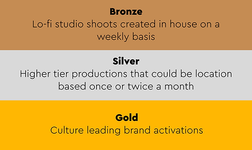
Stakeholder alignment workshop - I ran a workshop to align stakeholders on key decisions for ASOS Live. Together we defined the intended show frequency, identified the best timings based on app traffic, agreed the type of content and which team would manage it, and mapped all possible customer entry points to determine where the feature should live in the app.

Jobs to be done
Alongside my PM, we created a Jobs To Be Done board thatcaptured our customer research and helped us structure insights into clear needs, pain points and opportunities. By mapping functional, emotional and social jobs across the shopping journey, we could see where customers were seeking inspiration, where friction occurred and what behaviours shaped their decisions. The framework highlighted opportunities for ASOS Live to step in - from delivering authentic, styling-focused content to reducing uncertainty at the point of purchase - and became a shared reference point for design, product and engineering alignment.
The proposition

Objectives
1
Increase brand relevancy
2
Drive sales and conversion from content
Prototyping, usertesting and iteration


Branding was critical to signal ASOS’s first video experience and win customer confidence.
With only three weeks until launch, I still hadn’t received branding input from the creative team. I urgently needed a logo and finalised look and feel for stakeholder sign-off. As ASOS’s first ever video proposition, the branding had to clearly signal what we were offering and give customers confidence to interact with the app in a completely new way.

User testing showed the branding failed to communicate what ASOS Live really was.
When the brand team finally shared their signed-off concept, it looked great but failed to stand out from other ASOS campaigns or explain what ASOS Live actually was. I needed to push back carefully, so the first step was user testing. The results gave me evidence to take back: customers were unclear on the proposition, with some assuming it was a new homeware range and others thinking it was simply another sale.
Pushing back with evidence
To challenge the brand team’s signed-off concept, I mocked it up in situ to show how the logo not only failed to explain what ASOS Live was, but also made the navigation tab bar appear to bleed into the artwork. I also created my own alternative concept still using their font style choice, including a motion logo inspired by a live recording transmission dot, to demonstrate what was needed. Armed with these mockups and user testing insights, I brought the brand team into a collaborative session to align on the right solution for this critical product launch.


Brand design
My design
A week of solid workshopping with brand creative

Working closely with a designer from the brand creative team, we set out to define how “Live” should be represented to our customers. The question was simple: what visual cues does Gen Z already associate with live content? Social media was the obvious place to look.
We developed two concepts - one inspired by the Instagram Live badge, and another based on the pulsing transmission dot I had explored in my earlier proposal. Usertesting both options gave us clear insights and the confidence to move forward. The transmission dot resonated most with customers, and we presented it to the management committee for sign-off.
The first one looks like a story. It feels like there’s a story there, but I feel like the other one is more like it’s happening RIGHT NOW. Like it’s live.
The red dot is what I more closely associate with being live.
Something about the blinking motion of the red dot makes me feel like this video is currently live, like it’s being live streamed right now
Final design

Pre live show

Live show

CRM
Successes
Established a scalable live commerce format
The initial launch generated strong watch time and repeat engagement, validating demand for live, video-led shopping within the ASOS app
Drove high-intent product exploration
Live broadcasts translated directly into product interaction, with viewers actively moving from content to commerce in-session
Outperformed internal engagement expectations
Engagement exceeded comparable content benchmarks, demonstrating that live shopping resonated beyond a brand experiment and functioned as a performance channel
Collectively, this positioned ASOS Live as a meaningful driver of engagement, product discovery and commercial activity rather than a one-off marketing moment.
Insights
Video strengthens purchase intent
Customers who engaged with live content converted at a higher rate than non-viewers, reinforcing the role of immersive content in reducing friction and increasing confidence to buy
Increased depth of session quality
Viewers spent longer in the app and explored more products, indicating richer consideration behaviour rather than passive consumption
Shift towards inspiration-led commerce
Live formats encouraged browsing behaviours closer to social platforms, blending entertainment with transactional intent and signalling a broader opportunity to evolve the shopping journey
In short, video-first experiences did not simply capture attention. They improved session quality, strengthened behavioural intent, and demonstrated the commercial viability of inspiration-led shopping at scale.
Learnings
-
Content needs to scale: High-quality studio shoots worked well, but to reach more customers, ASOS needed to expand content creation through additional formats and sources.
-
Clarity matters: Ensuring customers instantly understood the purpose of live shopping was critical for adoption.
-
Authenticity drives success: Sales-focused shows risked turning users off - unscripted, styling-led content performed better.
Press and media
-
The Industry.fashion - How ASOS is strengthening customer engagement with new live shopping experience
-
Retail Technology Innovation Hub - Asos Live creator led immersive video shopping fashion experience goes live following trial
-
Retail Week - Asos launches creator-led live shopping
-
Retail Gazette - ASOS rolls out 'New era' of video shopping
-
Birmingham Mail - ASOS brings in big change for shoppers after 'successful trial'
-
Trend Hunter - ASOS Live Blends Creator-Led Content with Real-Time Shopping
-
The Sun - ASOS rolls out huge change to its app - and it's perfect for shoppers who love TikTok and Instagram
-
The Retail Bulletin - ASOS hails "new era" of video shopping


